New Uniforms

Clemson has a... wait for it... BRAND.

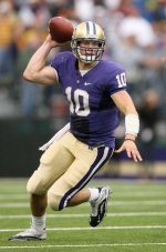
Lol - Clemson’s uniforms are some of the best in CFB.

If you think purple and orange is a nice color combo your eyes are as good as @GrandpaSankey's.

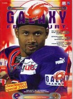
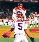
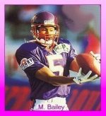
That color scheme has grown on me due to following the Frankfurt Galaxy as a kid because of Mario Bailey.

vatzqusc46pe.jpeg

https://us.v-cdn.net/5020263/uploads/editor/9s/r7cz1koea0m8.j
peg

wcerng3y6uj9.jpeg

95rk8iy634kw.jpeg
 
Last edited:
Shocking that Adidas who paid 40 million more than their competitor required that the jerseys look like stock Adidas with giant stripe and W logos.
 
I could have drawn up better uniforms as a five year old with a box of crayolas. Not surprising that some of you are okay with this shit considering our state’s iconic fashion statement is a flannel shirt or a fleece REI vest with cargo shorts and hiking boots. Fuck off. Better than evil Phil Knight Nike, right you dumb fucking nerds?
 
Last edited:
The font is disgusting.

Congrats to the AD SQWAD for further fucking up our brand

You're the only one who seems to despise the font to that degree. It's not perfect, but it's 30,000% better than the bubble font we just came from.
 
Left to right. No, because branding is important and the purple helmet detracts from the brand. The second look is fine as a third alternative for special occasions. The third one could be improved with gold pants. That would have made them the traditional away colors. Add a stripe to the fourth set of pants and you have the traditional home look.
No more than 3 sets needed and only minor modifications get you a pretty good look. And I concur with the thought that these were leaked on purpose. I assume the AD is reading these comments as we type. If not shame on her.
 
Last edited:
Ok anyone have an example of a uni that looks good?? So much complaining (ddy) and nothing to actually show what is wanted. You want the classic look of bama but also a modern style to attract recruits? You want stripes? Show good pics of these things. Its so easy to say it looks bad but if you cant show something that you thinks is a good uni then you just wont be happy.

4/5 on the unis for me

sl8td0tdj5uo.jpeg

Now fuck off.
 
The font is disgusting.

Congrats to the AD SQWAD for further fucking up our brand

You're the only one who seems to despise the font to that degree. It's not perfect, but it's 30,000% better than the bubble font we just came from.

It’s too skinny, weirdly shaped, and it’s almost italicized.

I’m into graphic design/infographics/fonts. That font fucking sucks.
 
Ok anyone have an example of a uni that looks good?? So much complaining (ddy) and nothing to actually show what is wanted. You want the classic look of bama but also a modern style to attract recruits? You want stripes? Show good pics of these things. Its so easy to say it looks bad but if you cant show something that you thinks is a good uni then you just wont be happy.

4/5 on the unis for me

Assume these examples are using the adidas colors. (I swiped most of these pics from @UWBolt)

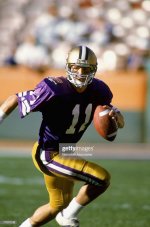
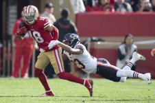
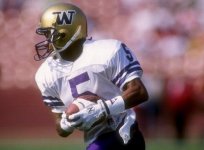
The 49ers picture shows how the stripes work on a modern jersey cut (and Don James based his uniforms on their striping). Nebraska’s stripes are an example on a current adidas uniform.

mkjz0i4x6a0e.jpeg
kbbp5xbntu67.jpeg
r00hzt73pyru.jpeg
8ndq6174iee2.jpeg
 
I've made my thoughts known. I also want a consistent brand. I think the Oregon flash has ultimately fucked with our AD and large portions of our fanbase, who think that needs to be emulated.
 
Ok anyone have an example of a uni that looks good?? So much complaining (ddy) and nothing to actually show what is wanted. You want the classic look of bama but also a modern style to attract recruits? You want stripes? Show good pics of these things. Its so easy to say it looks bad but if you cant show something that you thinks is a good uni then you just wont be happy.

4/5 on the unis for me

View attachment 20591

Now fuck off.

I didn't think it was so bad until I see this right under the new ones. The numbers are awful. Maybe if we spam social media enough it isnt to late to get them to bold the numbers atleast.
 
I've made my thoughts known. I also want a consistent brand. I think the Oregon flash has ultimately fucked with our AD and large portions of our fanbase, who think that needs to be emulated[/s] immolated.

fixed
 
Where's the thread about the new jerseys after these ones have run their course? I prepared for the worst and yet I'm still somehow disappointed. ///
 
Sure, high school is easy when you're not exhausted every day. Anybody who has never played football will never understand. While others were just regular students taking it easy, I was waking up at 5 AM every morning for an hour of team lifting and conditioning before school and then going to practice for two and half hours after school with more conditioning after that. And that would be after not going to sleep the night before until 12 PM doing homework. The physical and mental fatigue is constant as a student athlete. I laugh at fucking betas who think they're hot shit getting good grades as regular students. Most of you fucking pussies couldn't handle playing football and going to school at the same time and would quit after a couple days. Most of you basement dwellers don't know what hard is because you've never put in any real hard, physical work a day in your life so shut the fuck up.

I played football, aau, and for my HS basketball. Stop you were just a pussy.

I played football, basketball, and ran track and got a higher GPA than you. Lake Washington doesn't play fucking football. I played in the same conference and whooped LW's pussy asses like they stole something every year. Ain't no pussy here and I'd whoop your ass in a fight. Stop with the fucking tuff talk. You ain't hard. None of you are better than anybody and most of you are straight pussy. Just stop. Your academic record doesn't give you status over anybody.

Lmfaoooo. If you hadn’t heard LW football is back. Went 9-3 my sr yr. We play basketball too.

We have 2 kids playing for UW and a couple others at FCS/D2 schools. A lot of others that turned down college offers because they could.

You definitely tried. I coasted still got into an actual universities.
Yeah well they were trash in my day. Not sure I'd consider the Colorado School of Mines an "actual university" but okay, sure dude. Whatever makes you feel better. Just don't try to put down others to do it. It's lame.

Cobra be sweeping your leg Fudge.

You know what I’m gunna say it.... I hope someone pushes you down the stairs at Autzen this year
View attachment 19212

Derek? When u repeatedly get pummeled you always resort to shit like this Pack, against HH rules. Man the fuck up and go after pup with what little resides between your ears...fucking coward.
 
I've made my thoughts known. I also want a consistent brand. I think the Oregon flash has ultimately fucked with our AD and large portions of our fanbase, who think that needs to be emulated.

Exactly! Brand consistency is the one concept the AD doesn’t seem to understand. They just go by fads. Fads don’t last. Beta programs change their uniforms all the time and add black when it isn’t a school color (thanks Sark!).

I don’t see programs like ‘Bama and Oklahoma changing theirs. Some like tOSU and Nebraska have modern alternates, but they’ve never abandoned their basic, traditional uniforms.
 
Inside scoop from my buddy on the team. Just what I’m seeing. Don’t twist. View attachment 20558

Make shoulder stripes double white on purple, and double purple on white. Make purple numbers larger on the whites (no gold border). Make W on Purple lids chrome gold. Make W on hip slightly larger. Add alt. gold pants with traditional pant stripes. Make gold on pants more gold to match lid and you've basically nailed it. I can live with these but they don't make me want to hump the mattress.

These are perfect. I think adidas finally got them right. Purple looks best in 25 years. Great job. Goodbye Nike
 
The font is disgusting.

Congrats to the AD SQWAD for further fucking up our brand

You're the only one who seems to despise the font to that degree. It's not perfect, but it's 30,000% better than the bubble font we just came from.

I ride with BTP on this. That font is fucking horrendous. I'm not a fan of these unis at all
 
Back
Top