Useful(?) (Ch)Interactive (Ch)Infographic

AIRWOLF

New Fish
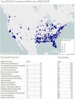
I am still ironing out some of this stuff, so I am not sure the map is 100% accurate yet. I am struggling a little with being able to show all of the detail related to multiple high schools in the same city.

Blue Chip (24/7 Sports Composite Top 400): 2006-2018
bk5zwpmf0yun.jpg

Interactive Tableau Map Link
 
Last edited by a moderator:
My .02, but what you might think of doing is adding category distinctions to the schools. Something like being able to toggle between schools(UW) or leagues (PAC) which would show recruiting maps per selection. You might set it up by having a table with all schools and a table with all leagues and then connect them to your aggregate table with a key. This would give us a visual of our(?) footprint vs. other schools or leagues. Depending on what sort of timings you have in there, you could slice by time, too. Good Tableau-job though, this is the best way to learn to Tableau-me.
 
Last edited:
My .02, but what you might think of doing is adding category distinctions to the schools. Something like being able to toggle between schools(UW) or leagues (PAC) which would show recruiting maps per selection. You might set it up by having a table with all schools and a table with all leagues and then connect them to your aggregate table with a key. This would give us a visual of our(?) footprint vs. other schools or leagues. Depending on what sort of timings you have in there, you could slice by time, too. Good Tableau-job though, this is the best way to learn to Tableau-me.

Yeah, I have all of that data already in my data set. Figuring out how to make it do what I want it to do is a little challenging. But that is the point of doing it.
 
I like how Florida is basically a map of itself. Covered in prospects all around then a big hole in the center where the Everglades are.
 
I like how Florida is basically a map of itself. Covered in prospects all around then a big hole in the center where the Everglades are.

I am going to work on zoomed in maps of LA Basin, NorCal, etc.. Florida would be a good one to do as well.

The challenging part is that I referenced the longitude and latitude off of the City name and when there are multiple high schools in the same city the dots end up mapping right on top of each other. I haven't figured out an efficient way to pull more precise coordinate information for the high schools themselves.

Start building your lookups:
https://opendata.stackexchange.com/...mentary-middle-and-high-schools-in-the-united
 
Imagine if the Great Migration of African Americans to the North (and a bit too to the West) for better paying factory jobs had never occurred.
 
Last edited:
Back
Top