You are using an out of date browser. It may not display this or other websites correctly.
You should upgrade or use an alternative browser.
You should upgrade or use an alternative browser.
Numbers, math, facts, etc.
- Thread starter GrundleStiltzkin
- Start date
https://twitter.com/EthicalSkeptic/status/1285297329470398465


I’m not understanding the message
GrundleStiltzkin
New Fish
https://twitter.com/EthicalSkeptic/status/1285297329470398465


I’m not understanding the message
Shit, I was counting on you for interpretation.
I think the implication of these is that these are the 50 "worst" counties in the country, but the average new cases and average deaths are about half of what they were last week for the "worst" counties.https://twitter.com/EthicalSkeptic/status/1285297329470398465


I’m not understanding the message
Not really sure that these charts are comparable, though, as the list of the "worst" counties changed, so population size differences would need to be accounted for? Lots of large counties (i.e., LA, OC, etc.) are in the first list but not the second.
BennyBeaver
New Fish
this thread reminds me of the North Korea one...
Houhusky
New Fish
Texas hospital data...
Blue = admitted for Covid symptoms
Red = admitted for something else but either tested pos or presumed pos, no covid like illness
Half of all covid19 coded inpatients in Texas show no covid like illness
The growth rate for NonC19 admittance is ~0% since June 18 to July 12

Im hearing InStyle Fashion model Fauci praised NY and Coumo covid response... makes sense!
Blue = admitted for Covid symptoms
Red = admitted for something else but either tested pos or presumed pos, no covid like illness
Half of all covid19 coded inpatients in Texas show no covid like illness
The growth rate for NonC19 admittance is ~0% since June 18 to July 12

Im hearing InStyle Fashion model Fauci praised NY and Coumo covid response... makes sense!

I think the implication of these is that these are the 50 "worst" counties in the country, but the average new cases and average deaths are about half of what they were last week for the "worst" counties.https://twitter.com/EthicalSkeptic/status/1285297329470398465


I’m not understanding the message
Not really sure that these charts are comparable, though, as the list of the "worst" counties changed, so population size differences would need to be accounted for? Lots of large counties (i.e., LA, OC, etc.) are in the first list but not the second.
It’s not clearly described for sure, not his best work.
What I see is the recent actuals for both deaths and cases are quite below the backwards looking moving average trend, which implies that some big data has dropped off and the moving average trend is going to shift down going forward. 48 days ago was like a week after the peak of the riots. Could be reading it wrong though.
BennyBeaver
New Fish
https://twitter.com/kylamb8/status/1285340960071835650?s=20
Source:[/b] Run @UnscriptedOhio1 podcast network covering #Buckeyes and Ohio sports. CMH to ATL to CMH. Major in Neuroticism, minor in OCD. Temporary Covid-19 analyst.
Source - Twitter - Twitter never lies
https://twitter.com/Algerwins/status/1285366949543735297
https://twitter.com/Algerwins/status/1285366949543735297
Source - Twitter - Twitter never lies
https://twitter.com/Algerwins/status/1285366949543735297
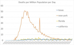
If you google Sweden you get 10 articles about how poorly they have faired. The only one that hit home was that even though they stayed open they lost US and European tourism anyway. Their economy is scheduled to shrink 5%. The US economy is on pace to shrink 6.5%. Damned if you do and damned if you don't. Less masks, open business and a fuck ton less fear mongering would have been preferable for me. Sweden wins, say 34-17?
Yep Sweden is Florida to our faithful media

8 people in Stockholm in ICUs with covid today
One sober item to share, since I’m an unbiased and fair person. Stockholm triaged anyone over 80 and didn’t let them in ICU to prioritize for younger people. Only offered them morphine to comfort and let them try to ride it out.
So the US is following the swedish model without hitting bandwidth limits and fucking old people.
Yet America is terrible, all the basement dwelling idiots are saying so.
GrundleStiltzkin
New Fish
Shoutout @PurpleThrobberhttps://twitter.com/calcBay1/status/1285708769662586882

